Bar Graph:
The advantage is for comparing data across categories. The disadvantage is it's difficult to see the exact number.
Line Graph:
The advantage is it shows changes in data over time. The disadvantage it doesn't really the work with the numbers.
Circle Graph:
The advantage is for comparing categories to the whole using percents. The disadvantage it's takes to long and too hard to create it.
Double Bar Graph:
The advantage is for comparing two sets of data cross categories. The disadvantage is depending the numbers that you choose will not work.
Pictograph:
The advantage is for comparing data that can be easily counted and represented using symbols. The disadvantage it's hard to use the symbols to determine the number.
2.) How graph can be misleading. Show 3 ways.


2a.) The following chart shows Pizza Sub Sales over a month. What 2 graphs would show the information accurately?

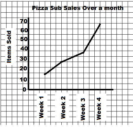
2b.) If you were selling Pizza Subs would you continue? How does your graph explain your answer.
Yes I would continue, because both graph shows the sales is going higher.
4.) Below you see 2 different examples of graphs showing healthy choices sold at the canteen. If you had to convince Mrs Mota that we should continue selling healthy choices which graph would you choose?
 I would show Mrs. Mota the line graph, because the sales are really going up every week.
4a.) Change each graph so that your information looks even MORE impressive. You may not change the data just the graphs.

Make the interval of the line graph smaller.

No comments:
Post a Comment
Note: Only a member of this blog may post a comment.