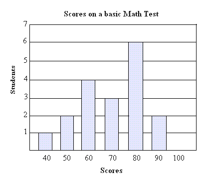
- Bar Graph
Disadvantages-The disadvantage of the Bar Graph is that you can't always have a specific interval for each set of data and categories.

- Double Bar Graph
Disadvantages-The disadvantage of a Double Bar Graph is that you can't always have the same interval for each set of data. It is also not good if you are trying to compare only one set of data across categories.

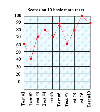
- Line Graph
disadvantages-The disadvantage of a Line Graph is that you have to pick intervals for the whole graph and it is also not good for comparing different categories in a set of data.

- Circle Graph
advantages-Best for comparing categories to the whole using percents. Sum of percents in a circle graph is 100%.
disadvantages-The disadvantage of a Circle Graph is that it is hard to convert the whole numbers into percentages, because to be able to convert whole numbers you have to multiply a number by 100.
disadvantages-The disadvantage of a Circle Graph is that it is hard to convert the whole numbers into percentages, because to be able to convert whole numbers you have to multiply a number by 100.

- Pictograph
advantages-Best for comparing data that can be easily counted and represented using symbols.
disadvantages-The disadvantage of a Pictograph is that the numbers that represents a set of picture should be the same. Another picture can't have a different number to represent the visual.

disadvantages-The disadvantage of a Pictograph is that the numbers that represents a set of picture should be the same. Another picture can't have a different number to represent the visual.

- Distort the Scale-Creating a bad interval. It also allows you to have a smaller interval but bigger range.
- Distort the Visuals-Make a set of data or a row of data, much bigger than the other ones.
- Distort the Size of a Bar- Create one of your bar wider or if you are using a grid paper add more squares.
B. Yes I would continue selling Pizza Subs because on the Line graph, it shows the changes overtime on the data which means it is showing that the sales get more higher and higher every time.
4.A. For me to able to convince Mrs. Mota that we should continue selling healthy choice, I would use the line graph because it clearly shows that every month the sale kept on getting higher and higher which means that many students like the choices.
B. For the LINE GRAPH I would change the intervals to much smaller number like start at 2 so then it would be more higher on the graph instead of it so low.
For the PICTOGRAPH I would change the number that represents each heart to much smaller number like 2 so then it would be more longer but it is very important to make sure that all hearts are the same in size.
No comments:
Post a Comment
Note: Only a member of this blog may post a comment.