Bar Graph
advantages: is best for comparing data
disadvantages: does not show an accurate amount or number
Double Bar Graph
advantages:is most likely to be used for comparing two different data across the same categories
disadvantages: does not show the precise amount
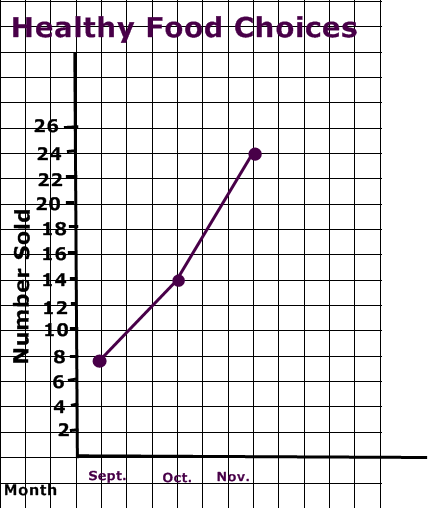
Line Graph
advantages: shows the changes in data's over time
disadvantages: exact number is not likely to be shown. estimation is considered necessary
Circle Graph
advantages: best for comparing categories to the whole using percent
disadvantages:hard to comprehend
Pictograph
advantages: shows data through symbols that represent a certain number
disadvantages: multiplication is necessary to know actual number
A graph can be misleading
a) Distorting the Scale
- breaking in the y axis

b)Distorting Visuals
- making the picture bigger
Note: each flower represents
5 people voted to a
particular flower

c)Distorting the Bar Size

c)Distorting the Bar Size
-making the bar larger,
emphasizing it's large amount

3a)The following chart shows Pizza Sub Sales over a month. I would choose a bar graph and a line graph to show the information more accurately.
3b)Yes i would continue. Because my graph only shows that my sales gets higher and higher.


4) If I had to convince Mrs Mota that we should continue selling healthy choices, i would use the Line graph. Because just by looking at it, Mrs. Mota would notice that the lines are going higher and higher.

No comments:
Post a Comment
Note: Only a member of this blog may post a comment.