Bar graph:
Advantage- Best for comparing data across categories.
Disadvantage- Can be easily misinterpreted.
Double-Bar graph:
Advantage- Best for comparing two sets of data across categories.
Disadvantage- Can be easily misinterpreted.
Line graph:
Advantage- Best for showing changes in data over time.
Disadvantage- Use only with continuous data.
Pictograph:
Advantage- Best for comparing data that can be easily counted and represented using symbols.
Disadvantage- It does not show the rate of change in height.
Circle Graph:
Advantage- Best for comparing categories to the whole using percents. The sum of the percents in a circle graph is 100%.
Disadvantage- Good for comparing to only 3-7 categories.
*I couldn't fix the sizes*
_______________________________
2.
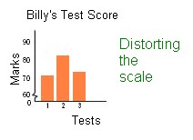
Distorting the scale: A break in the y axis would create bad intervals.
Distorting the visuals: Making a category's visuals larger than the other categories would take up more space than the other categories.

Distorting the size of bars: One bar's width are larger than the other bars.

_______________________________
3a)
If you wanted to know how well your sales were going, I would pick a line graph.
If you wanted to compare a week's sales, I would pick a bar graph.


3b)
Yes I would continue.
By using both line graph and a bar graph, you could see that every week the sales are increasing.
_______________________________
4.
If I were to convince Mrs. Mota that we should continue selling Healthy Food Choices, I would pick the line graph as my representative. I would choose a line graph because it shows how Healthy Food Choices that are being sold, are increasing every month.
4a)


No comments:
Post a Comment
Note: Only a member of this blog may post a comment.